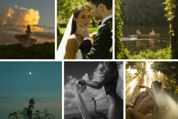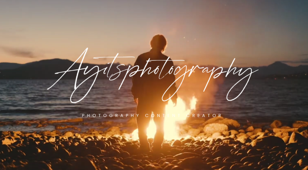
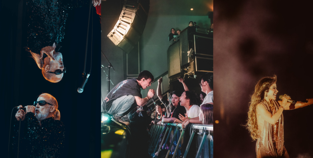
I came across Matt Solie’s also known online as Ayitsphotography, photography while researching different styles and approaches to modern commercial and portrait work. Right away, his site stood out—not because it was flashy or over-the-top but because it was clean, intentional, and full of color. I was immediately drawn to the vibrant tones and the way each image is thoughtfully composed. Whether he’s shooting portraits, commercial content, or landscapes, there’s a strong line of visual identity that ties everything together—and it’s far from boring or muted.
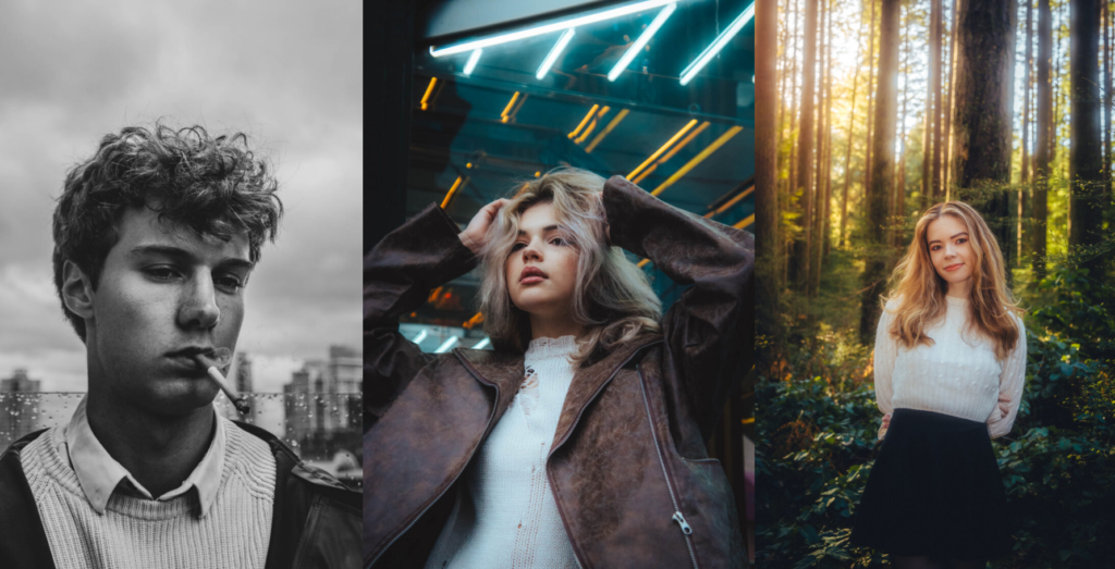
One of the first things I noticed was how much he leans into rich, saturated color. It’s not the kind of overdone editing you see in hyper-processed images. His color work feels natural but bold—like the real world turned up just a bit. Reds, blues, greens, and golden tones all show up often in his work, but never in a way that distracts. Instead, they enhance the photo’s overall atmosphere and make each frame feel immersive. It’s something I’ve been paying more attention to in my own photography. I used to default to softer tones or black-and-white edits, thinking that was the “safer” route—but Solie’s work reminds me that color, when used intentionally, can actually say a lot.
His portraits are especially strong in that way. The backgrounds often feel carefully chosen to match or contrast the subject’s outfit or pose, and the lighting brings everything to life in a clean, punchy way. You’ll see blue skies, crisp reds, and warm skin tones—all layered together without any one element stealing the show. And yet, the subject is always the clear focus. It’s a really good example of how color can be a storytelling tool, not just a design choice.
While the portrait work is what pulled me in at first, what kept me interested was how diverse his portfolio is. He doesn’t stick to one niche. There are lifestyle shots, commercial product images, candid-feeling street photography, and wide open landscapes. And across all of it, the same visual identity stays consistent. That’s not easy to do, especially when switching between such different subject types. But whether it’s a model in a studio or a mountain range at sunset, he treats each image with the same level of composition, color, and clarity.
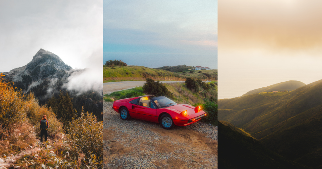
His landscape and environmental photography especially impressed me. He captures large, open scenes that are full of vibrant earth tones and dramatic skies, but never in a way that feels like he’s relying on the setting alone. There’s a sense of balance in every shot. His framing and use of negative space show an understanding of how to let the landscape breathe while still guiding the viewer’s eye. Even though the places themselves are beautiful, it’s clear that he’s still making choices—how much sky to show, where to place the horizon, whether to shoot wide or more cropped. There’s control behind it, but it doesn’t feel stiff or forced.
What I also really appreciate about Solie’s style is that it doesn’t feel overly trendy. He’s clearly modern, and his work fits within today’s visual culture, but it’s not mimicking what’s already popular. Instead, it feels like he’s built a lane for himself—one that blends commercial polish with personality. His work is clean, bold, and accessible, but it still carries a distinct artistic identity. That’s something I think a lot of photographers, including myself, are trying to figure out: how to stand out without overdoing it. Solie seems to do that naturally.
Another thing I’ve taken away from studying his portfolio is how important location can be—not just for landscape work but even in portrait and lifestyle photography. He shoots in a wide variety of places, from industrial buildings to empty roads, grassy fields to colorful walls. Each setting adds something to the story or aesthetic of the photo, and it’s clear that he’s not just choosing places randomly. That level of intentionality is something I want to start applying more actively in my own shoots. Even if it’s something as simple as finding a better backdrop for natural color contrast, those small decisions add up.
Spending time with Matt Solie’s work has definitely expanded how I think about color, space, and consistency. I went into this research trying to better understand how modern photographers balance creative freedom with commercial direction, and I think his work is a solid example of that balance done right. There’s clearly client work in his portfolio, but it never feels soulless or generic. His tone is strong across the board.
More than anything, this process has reminded me that developing a signature style doesn’t always mean doing the same thing every time. Instead, it can be about the way you see the world—how you frame it, how you color it, and how you choose what to include or leave out. Solie’s images show that having a clear vision can connect even the most different types of work, as long as you’re consistent in how you approach them.
Have a story, a moment, or an idea you think deserves to be captured? I’d love to hear about it! You can submit your experiences through the “Share a Story” form on my website or check out the “Suggest a Shot” page to let me know what you’d like to see next.
Lastly, I would love to stay connected, so be sure to Follow Me on Instagram, Facebook, and Pinterest (linked at the top of my site). I’ll be sharing new content, behind-the-scenes moments, and more glimpses into my creative process.
To read more content like this, click this link: Grace Yeaple Media Blogs!
All photos belong to Matt Solie (also known online as Ayitsphotography)
Check out his website here: https://msolie.com/